Graphic designer specializing in visual identities and interface design. I help you create works that enhance your business and resonate with your audience.
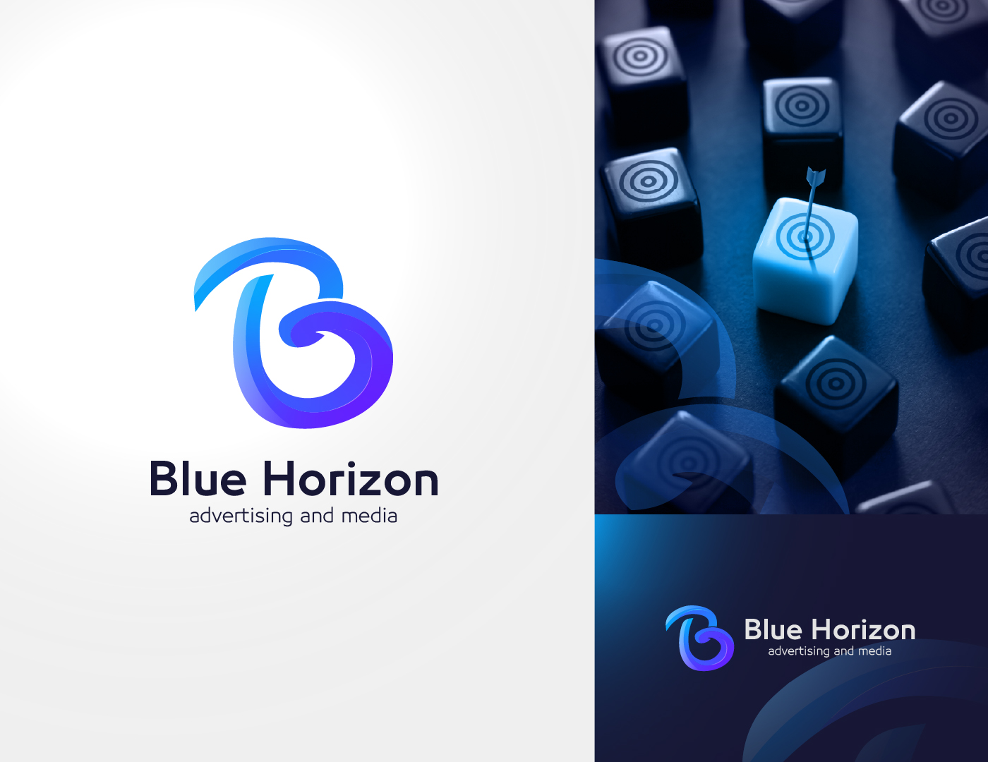
The logo is based on the letter "B" from the company's name, Blue Horizon. The curved design reflects smoothness and innovation.
The interwoven elements in the "B" symbolize communication and fluidity, which are essential aspects of advertising and creativity.
The small arrow (seen in the visual concept) represents precision and targeting, highlighting the company's focus on reaching the right audience.
Colors:
Blue is the primary color, symbolizing trust, professionalism, and creativity—core values of an advertising company.
The gradient effect adds energy and dynamism, reflecting the ever-evolving nature of the media and advertising field.
Accompanying Visual Element:
The accompanying image (blue piece with the arrow) emphasizes uniqueness and distinction, showing one standout blue piece among others, representing the company's ability to highlight brands amidst competition.
Typography:
The typography is clean and modern, conveying the company's professional and straightforward approach to delivering services.
Overall Harmony:
The combination of the text and symbol creates a strong visual identity, making the company recognizable even through the standalone "B".